Friday, January 31, 2014
magazine cover preview part 2
i love this photo because of its simplicity and it looks so clean, Harper's Bazaar is a fashion magazine and the photographer made it so it gets the readers attention by having Paltrow just standing and posing mysteriously and so bold not facing the camera and the photographer made the dress fit her and really show her "good side" and the black letters behind her also gets the peoples attention "Gwyneth Paltrow Revealed" and "the new look" making the readers wanting to know the full story.
photoshop intoduction
Common Tools
1) Crop Tool; Is used to cut a part off your photo.
1) Crop Tool; Is used to cut a part off your photo.
2) Lasso Tool; Is used to select an specific part of your photo.
3) Text Tool: it allows you to add a text in your photo.
4) What buttons do you push to "Undo" a mistake you made? Command-Z(Mac) or CTRL-Z (PC)
5) What can you open to "undo" more than one mistake? How do you open it? You have to pullup the History Palette you can do this by going to the Window---> History menu.
6) How do you rotate an image? you go to image menu and select image rotation.
7). If you don't like the initial cropping box you drew, how can you change it before you make your crop? yes
8) Under the heading "Resizing while Cropping" when you enter dimensions as you crop, what are you telling Photoshop to do as you crop your image? Fill in the width and height fields in the option bar while the crop tool is selected.
9) What is the correct resolution for newsletters and newspapers? the range of 150 to 200 ppi
10). What is the correct resolution for magazines? magazines are likely to prefer high resolution images of 250 ppi or more.
Monday, January 27, 2014
Thursday, January 23, 2014
My favorite cover
#2 Vanity Fair (August 1991)
Vanity Fair's provocative cover shot of the naked and hugely pregnant Demi Moore (also shot by Annie Leibovitz) projected the actress to even greater heights after the huge success of the movie Ghost the previous year. The cover helped firmly establish Moore as a member of Hollywood's A-List at the time. - See more at: http://www.magazine.org/asme/magazine-cover-contests/asmes-top-40-magazine-covers-last-40-years#sthash.X0rQPnut.dpuf
This photo is very strong and powerful. Demi is very exposed yet modest at the same time. I like how that headline doesn't take away from the photo because its very light and calm. The head lines make the photo more noticeable because the background is dark and the wording is light so its still noticeable but it doesn't take away from the photo.
magazine cover preview
| Masthead (logo) | The name of the magazine displayed in a specific typeface. This is the visual branding of the title and is often done in a specially designed typeface to be very recognisable and unique. The masthead is usually used on the contents page inside as well as the front cover, and as a logo for advertising and branding purposes |
| Dateline | Month and year of publication, often with the price. |
| Main image | The image is used in a classic way, the face is big enough to stand out on the news-stand, with the model making full eye-contact |
| Model credit | The photographer and model credit is usually on the contents page |
Cover lines | A mistake often made with cover lines is that they run over an image that has a lot of colour changes, rendering the words invisible. its whats telling you whats inside the magazine |
| Main cover line | taking up almost a quarter of the magazine cover - and comes in three layers, each with a different colour. It promotes the use of naked male centrefolds, a feature of Cosmopolitan in the UK since its first issue. Note the main cover line is positioned against the model's shoulder so it shows up clearly |
Left third | The title must be easily recognisable in a display of dozens of competitors. The start of the masthead is important here, as are short cover lines that are easy to read |
Bar code | Standard bar code used by retailers |
Thursday, January 16, 2014
fixed portrait shoot submission
 |
| 100 |
 |
| 200 |
 |
| 400 |
 |
| 800 |
 |
| 1600 |
 | ||
| 3200 |
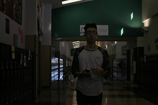
What was the best ISO setting to use for your portraits?
The best setting was 3200 iso
What was your next best photo?
I think the second best iso was the 1600 one, i think bright pictures look cool.
Were you able to create equivalent exposures to your best photo by changing the aperture and shutter speed?
we didn't really mess with either of those.
What did you learn from this activity that you will apply to your real portrait shoot?
I learned what ISO does and how it has a big effect on things
Subscribe to:
Comments (Atom)


